Assessing Usability and Adoption: A Case Study on Direct Access
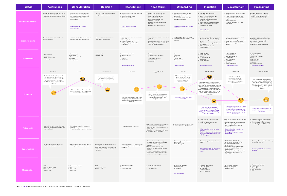
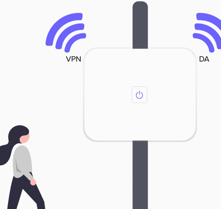
Client introduced Direct Access (DA) to enhance employees’ internet connectivity without relying on traditional VPN. However, many employees still defaulted to using VPN even after DA was implemented. I was brought on board as a UX Researcher to uncover the reasons behind this behavior and to help promote DA adoption through user-centered insights and design recommendations.
Project Scope
- Client– British Telecom
- Timeframe– 2 weeks
- My role-UX Researcher
- Team– We were a team of two, I was the sole researcher working along with a UX designer.
- Method– Comparative usability testing
- Tools– Mural,Adobe XD, Figma, Teams, Word Speech to text tool
Project Overview
![]() CLIENT KICKOFF
CLIENT KICKOFF
In our kickoff, client highlighted a growing concern: although Direct Access (DA) had been rolled out as a superior internet connection method, employees were still defaulting to VPN. This contradicted expectations and affected internal IT strategy.
The goal was clear — understand user behavior and provide evidence-based recommendations to increase DA adoption, backed by usability testing and stakeholder-aligned research.
![]() OBJECTIVES
OBJECTIVES
The research aimed to uncover:
- Behavioral Patterns:
Why do users continue using VPN despite the availability of DA? - Tool Compatibility:
Are there specific tools or technical blockers that force VPN usage? - Awareness Gaps:
Do users even understand what DA is and how it benefits them? - Usability & Messaging:
Are current communications (pop-ups, support articles) effectively guiding users? - Accessibility:
Are the tools and messages inclusive and screen-reader friendly?different propositions involved.
![]() NOTES
NOTES
- Clients broader vision was to modernize internal digital experiences through the Colleague Digital experience program.
- The pandemic had shifted many employees to remote work, making internet connectivity more critical.
- Direct Access was meant to provide smoother, always-on connectivity without login screens, unlike VPN.
The Process
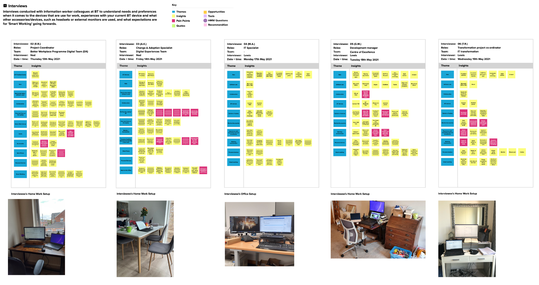
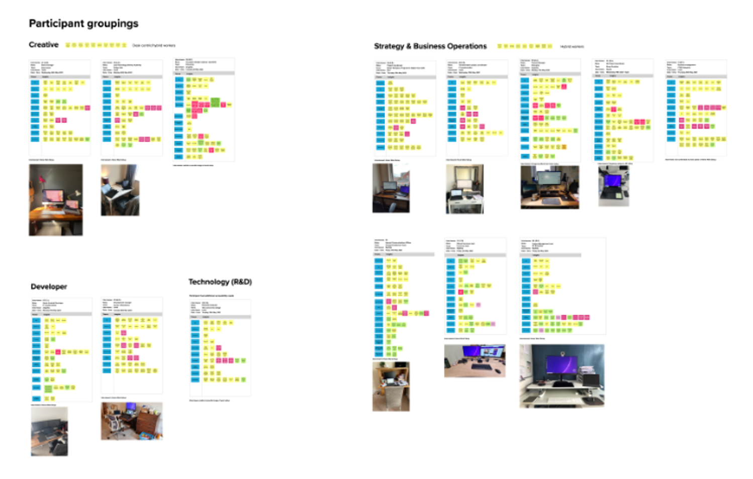
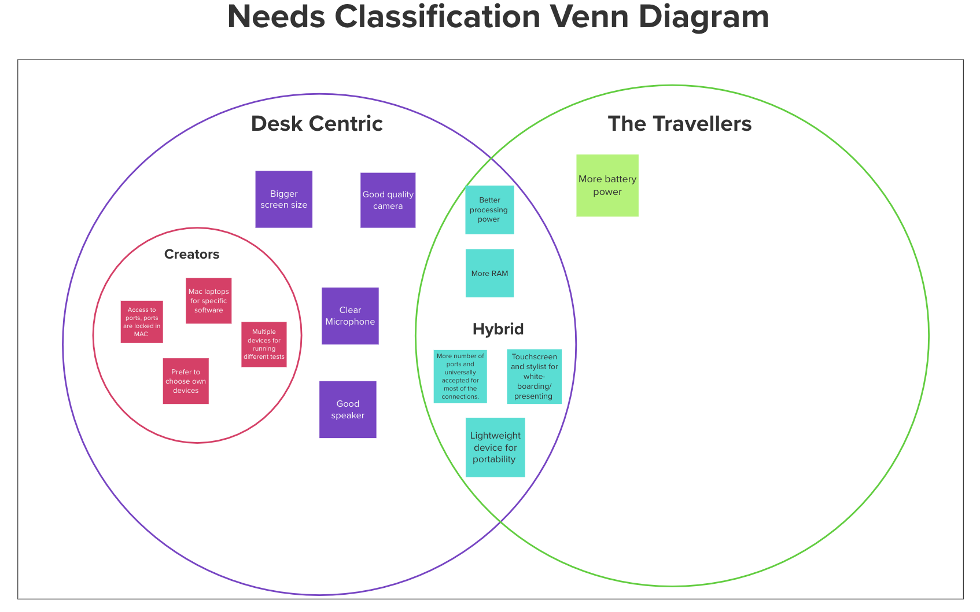
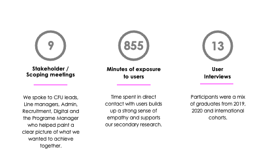
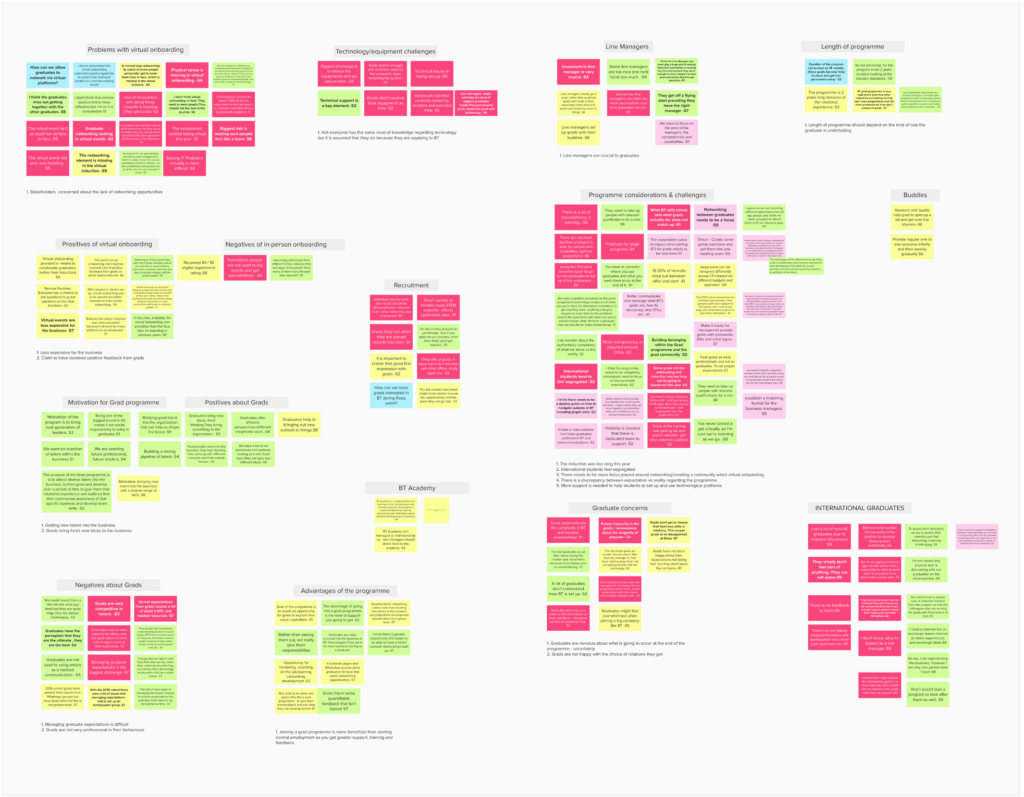
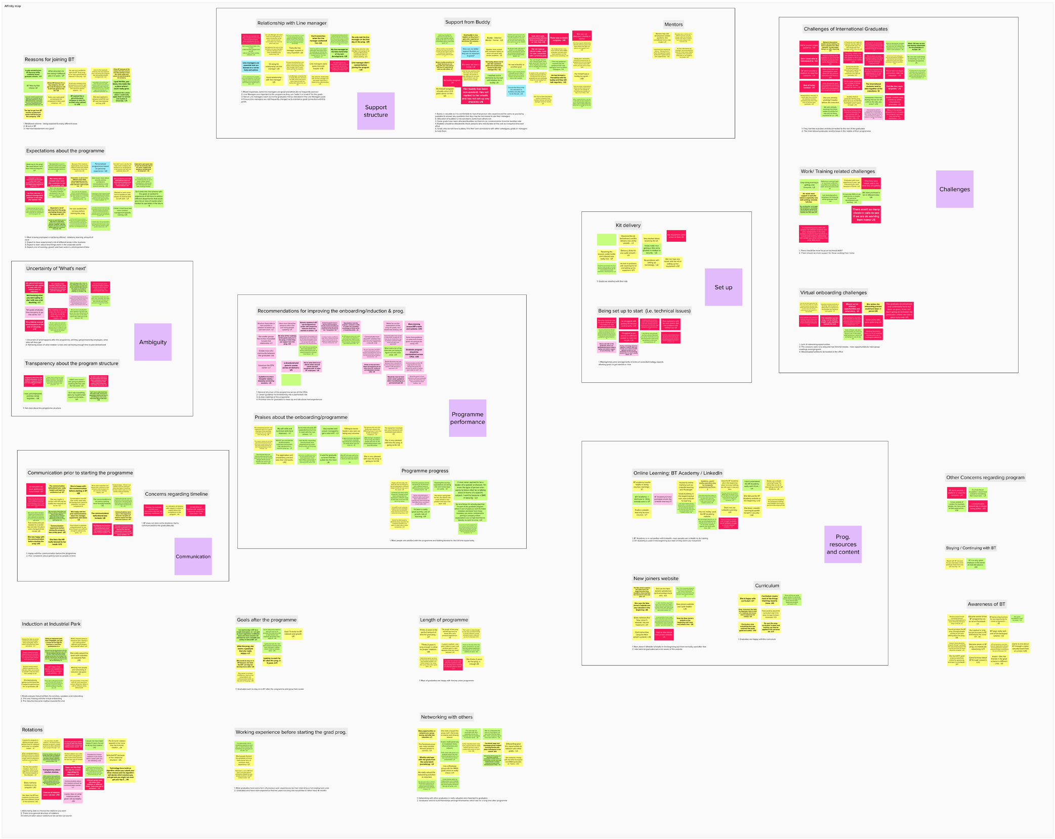
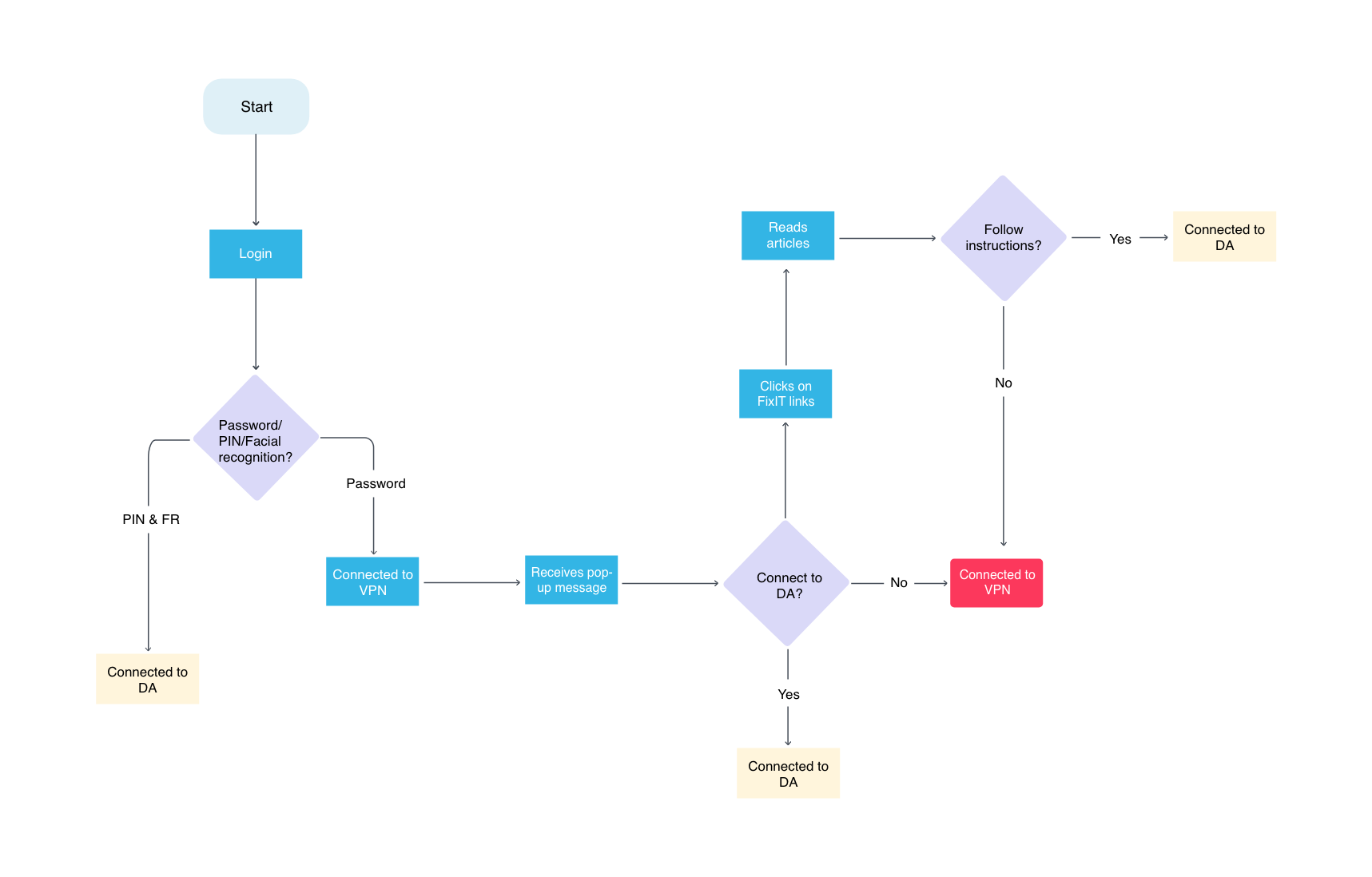
We followed the Double Diamond approach, starting with a Discovery phase where I conducted 1:1 interviews with BT employees to explore their behaviors, preferences, and challenges around internet connectivity tools. Insights were synthesized using affinity mapping to identify key themes. In the Define phase, we distilled these insights into core user problems, which informed our next steps.
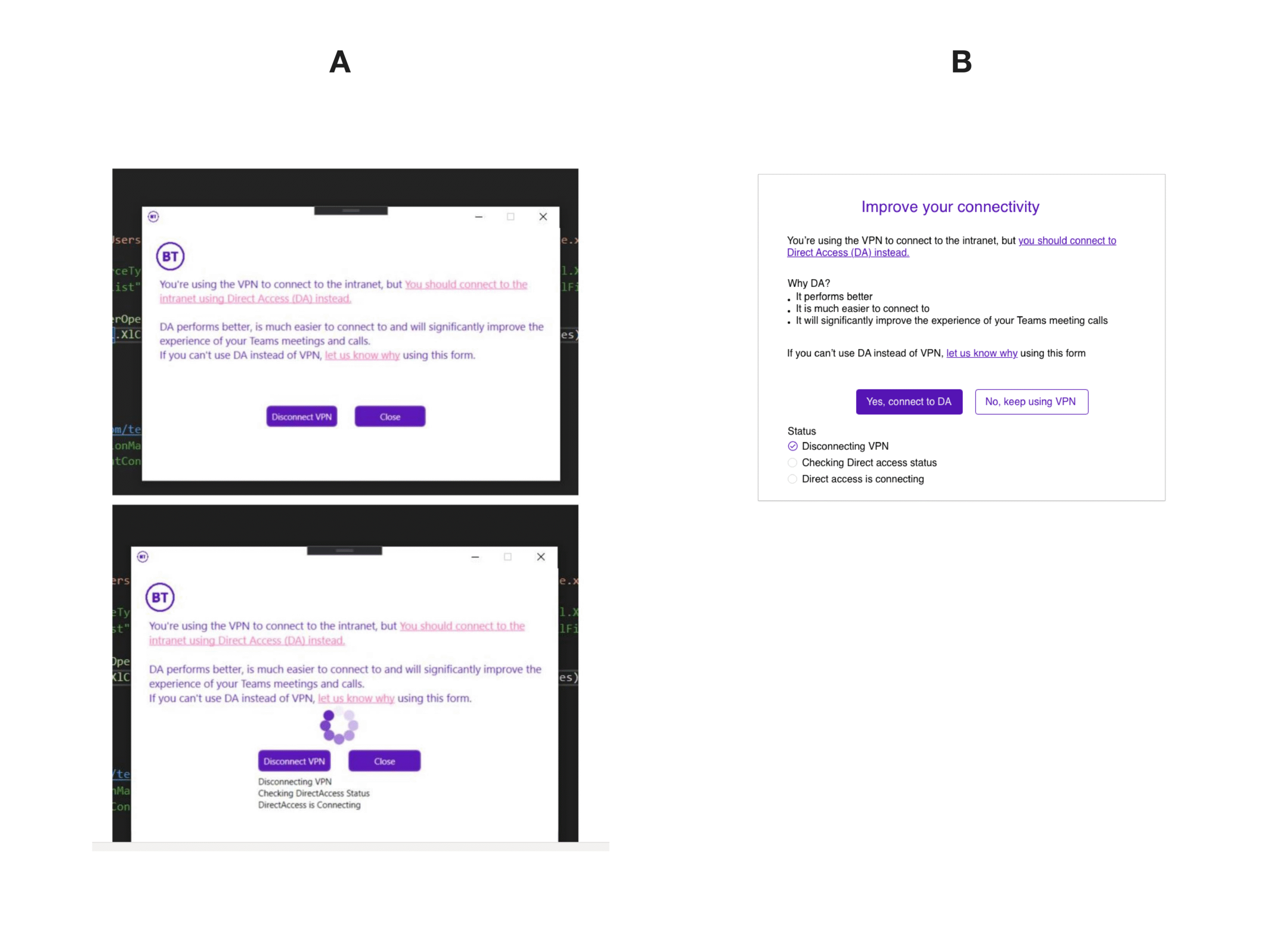
✏️ Why We Redesigned the Pop-up and FixIT Article (Pre-Testing)
Before conducting usability sessions, we reviewed the existing pop-up message and FixIT support article with a critical lens, informed by:
- Initial stakeholder concerns about low DA adoption
- Previous internal feedback suggesting users found the pop-up confusing and easy to ignore
- A quick internal audit that revealed dense layouts, technical jargon, and lack of hierarchy
We also anticipated that:
- The action buttons could be reworded to be more user-friendly
- The content could benefit from clearer structure and accessibility support
- Support articles might overwhelm users due to long, unsegmented content
With this in mind, we created early design iterations of both components in collaboration with the visual designer. These mockups were not final but served as testable hypotheses — helping us explore what a more effective and user-centered version might look like.
These redesigned versions were then used in the comparative usability testing sessions to validate our assumptions and gather deeper feedback.
 1:1 Interviews with Comparative Usability Testing
Each participant session was divided into two parts:
Part 1 – Semi-Structured Interview
🔹 Methodology:
We used a semi-structured interview format, allowing flexibility while ensuring we covered key themes. This method encouraged participants to speak freely about their habits and challenges while giving us space to explore deeper based on their responses.
💬 Focus Areas:
- When and how users typically connect (VPN vs. DA)
- Whether they’ve used DA, and if not, why
- Their preference between VPN and DA
- Awareness or misconceptions about DA
- Tool compatibility concerns or connectivity issues
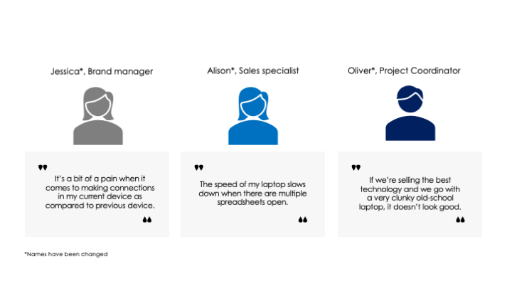
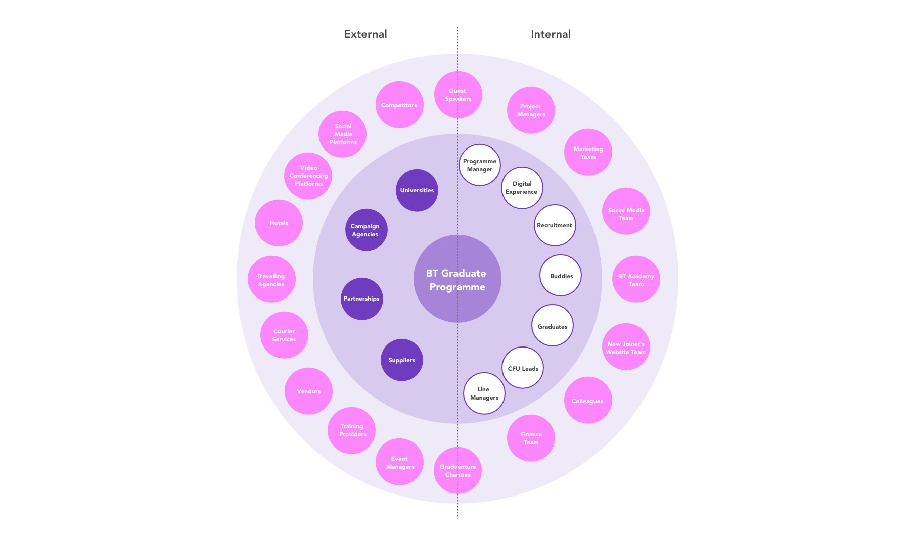
Target Audience:
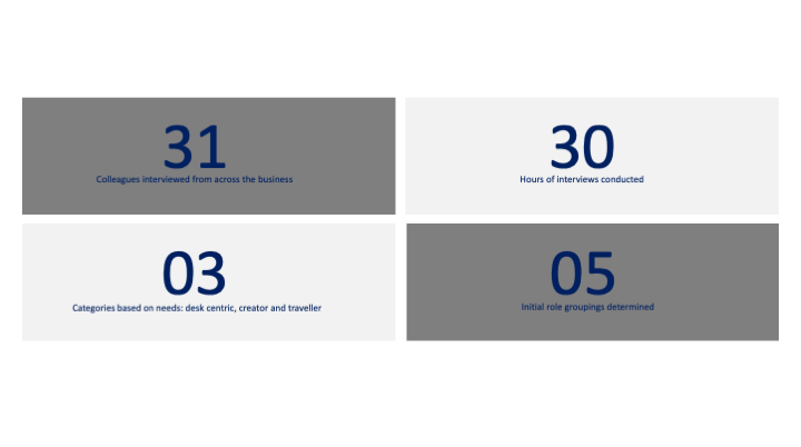
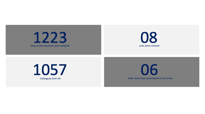
We spoke with 8 employees from diverse job roles and departments, each with varying levels of interaction with VPN and DA. Some participants worked in technical roles that required frequent tool access, while others were in business or support roles with more basic connectivity needs.
Part 2 – Comparative Usability Testing
🔹 Methodology:
We conducted comparative usability testing by showing participants two versions of the same design element (e.g., pop-ups and FixIT articles). Participants were asked to compare, express preferences, and explain their reasoning.
🧪 Tested Elements:
- Old vs. redesigned pop-up message promoting DA
- Original vs. improved FixIT articles (support documentation)
Participants shared feedback on readability, clarity, structure, and accessibility, which helped us validate the effectiveness of the design changes.d approach allowed us to capture both attitudes and usability feedback in the same session, making the insights richer and more actionable.

💡Key Insights
| Theme | Insight |
|---|---|
| 🔄 Habitual Behavior | VPN used out of habit; DA never actively explored |
| 🔧 Tool Gaps | Most key apps supported on VPN |
| 📣 Awareness | Users unsure what DA is, or how it’s better |
| ♿ Accessibility | Pop-ups and articles missed screen-reader best practices |
🛠 Deliverables
We provided a focused set of outputs to guide BT’s design, development, and communication efforts around Direct Access:
- Research Summary & Playback Decks
Key insights, user quotes, and findings were shared regularly to align stakeholders and support informed decision-making. - Redesign Recommendations
Actionable changes to the pop-up messages and FixIT articles addressing layout, language, and accessibility.
Users clearly preferred the redesigned versions for their clarity and ease of use. - Usability Testing Report
Comparative feedback from participants helped validate design choices and informed final iterations. - Accessibility Review
Highlighted issues such as screen reader gaps and unclear visual elements, with suggestions for inclusive design improvements. - Comms Support Content
Suggestions for internal messaging, including updated FAQs and benefit-focused content to help promote DA adoption.
 Reflections
This project taught me how behavior change isn’t just about better design—it’s about meeting users where they are, educating them, and removing friction one small step at a time. I learned how critical collaboration, accessibility, and microcopy are in nudging user behavior within large organizations.